| Author |
Message |
|
Woodgnome
Officer
Joined: May 27th, 2011, 15:18
Posts: 2609

|
 The UI thread Creating dedicated post for this, because the one Astelia posted a while ago instantly deteriorated into offtopic flaming of Astelias fail UI.
_________________

Guild Master of Frenzy
|
| November 19th, 2012, 17:49 |

|
 |
|
Mylí
Joined: October 29th, 2012, 22:10
Posts: 15

|
 Re: Random picture thread! Thought I would link solely because I dont think its finished, any input is good  http://postimage.org/image/496vys3lf/ http://postimage.org/image/496vys3lf/
|
| November 19th, 2012, 19:39 |

|
 |
|
Bella
Member
Joined: June 2nd, 2011, 2:42
Posts: 545

|
 Re: Random picture thread! MSBT, or some other scrolling text addon, instead of the original battle text thing... also something along the lines of Weakauras or Powerauras to show useful stuff, and DBM (you can't see if you do or don't have those)... i also find a cooldown timer or 3 helpful (Fortexxorcist and something else that puts the CD on the actual button... can't remember the name of it though... will dig that up at some point)...
THIS POST MIGHT BE EDITED WHEN I GET BACK, HAVING TO RUSH OFF...
_________________

ßellatorva - 100 Druid
Tørva - 100 Hunter
ßæn - 100 Death Knight
ßæl - 100 Warlock
|
| November 19th, 2012, 20:21 |

|
 |
|
Bella
Member
Joined: June 2nd, 2011, 2:42
Posts: 545

|
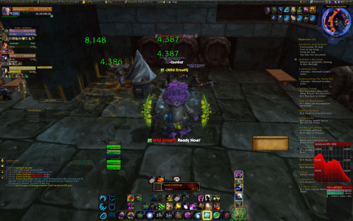
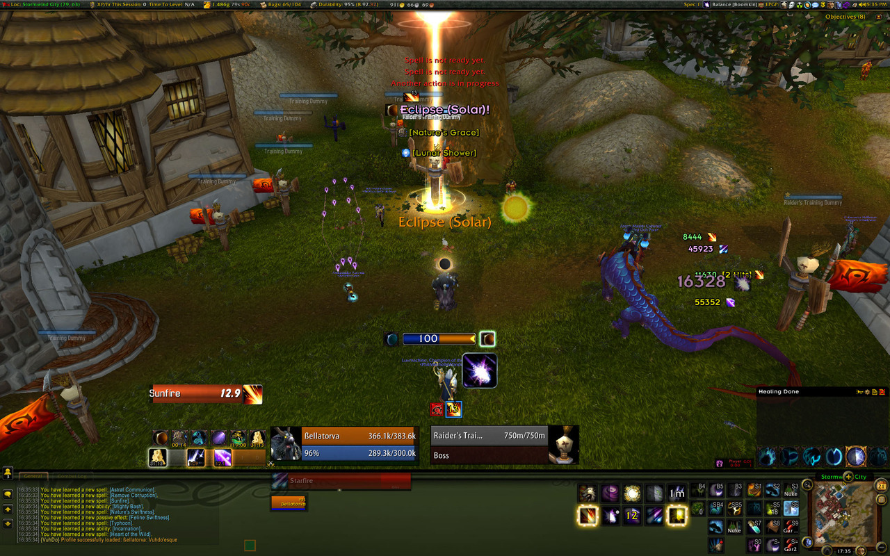
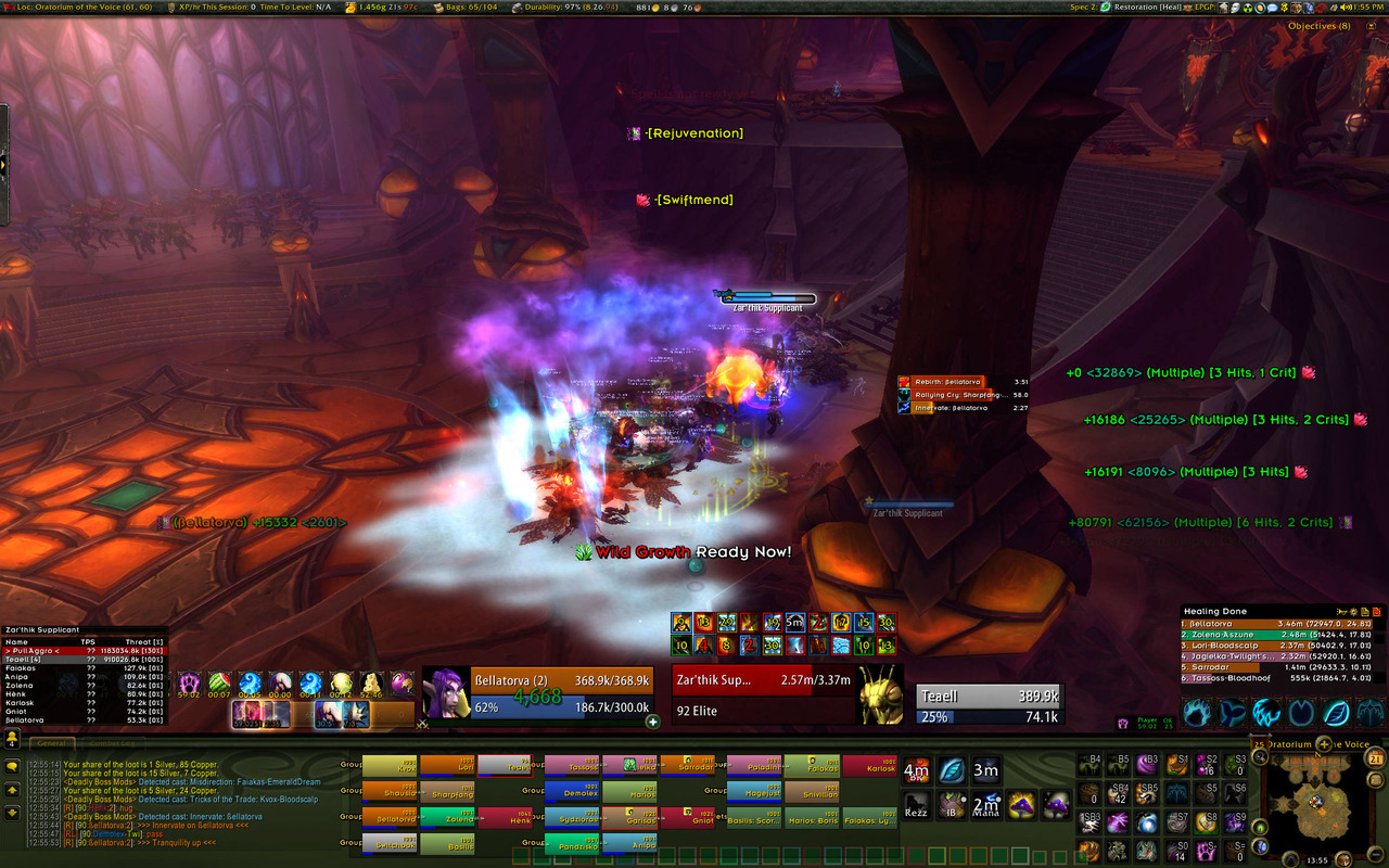
 Re: The UI thread Mine is also a work in progress, so any advice would be MUCH appreciated... OLD UI (What i had been working with):  NEW UI... buttons are layed out weirdly cause of new keypad and mouse... mouse hasn't arrived so not all buttons are in the right places etc. yet...  Boomkin spec The big Moonfire button underneath my power bar is a "you don't have a Moonfire on this target" reminder, and the Sunfire bar at the side is what both sunfire and moonfire DoT timers look like...  Resto spec (Note - i've set my vuhdo up to work with a 10 man team... hence 25man looks really messy and crappy) I'm only 50% sure i like having my vuh'do in that bottom bar... i might move my player and target frames in there, and have Vuh'do where those are currently...
_________________

ßellatorva - 100 Druid
Tørva - 100 Hunter
ßæn - 100 Death Knight
ßæl - 100 Warlock
Last edited by Bella on November 21st, 2012, 18:45, edited 3 times in total.
|
| November 20th, 2012, 18:53 |

|
 |
|
Woodgnome
Officer
Joined: May 27th, 2011, 15:18
Posts: 2609

|
 Re: The UI thread Pictures too small!
_________________

Guild Master of Frenzy
|
| November 20th, 2012, 22:49 |

|
 |
|
Winkle
Officer
Joined: June 7th, 2011, 21:03
Posts: 2339

|
 Re: The UI thread In your new UI the whole area around your toon is covered in stuff, i like to keep the area around my toon clear so i can see what crap i'm standing in and such.
_________________

|
| November 20th, 2012, 22:51 |

|
 |
|
Bella
Member
Joined: June 2nd, 2011, 2:42
Posts: 545

|
 Re: The UI thread My screen's too big for the screenshots to upload to tumblr... will make a login on an imagehosting site at some point soonish and repost...
Winks: I do see waht you mean... the timers for Moonfire and Sunfire used to be further down, but now the rest of my crap has moved up... so they were just thrown there without much thought... but with the rest of the stuff, i'm struggling with the balance of showing everything i need to see close-ish to where i'll be looking, and not covering up other stuff i need to see...
Also obviously there looks like a lot of space not being used in the bar across the bottom... this is due to A - mouse not being here, so the keybinds for that (18 buttons, plus shift and those 18 buttons) aren't all there, and B - Me being on my own, not in a 10 man raid, which is what my Vuh'do is set up to take up the space with...
_________________

ßellatorva - 100 Druid
Tørva - 100 Hunter
ßæn - 100 Death Knight
ßæl - 100 Warlock
|
| November 21st, 2012, 1:40 |

|
 |
|
Goldilocks
Member
Joined: August 24th, 2012, 10:50
Posts: 1095
Location: Erik's mom

|
 Re: The UI thread Why do you have such large dot timers ?
I have been tweaking my UI at the start of MoP and tried to go for the same idea of having a lot of data available in the middle-ish of the screen but there isnt room for everything without things getting really cluttered, so i moved a lot of stuff to the sides.
Once stuff has a set place you get used to it really fast anyhow.
Where do your DBM timers go?
_________________

|
| November 21st, 2012, 1:58 |

|
 |
|
Vodkaa
Joined: March 13th, 2012, 9:10
Posts: 509

|
 Re: The UI thread <--- elvui with ignite stuff and etc n ofc weakauras tweaking of uptimes of different stuff on the left hand side of my character so i can still see the "proc" thingies like for heating up and pyroblast! healing wise i love to have the raid frames in the middle under my character or left of my character to have open eyes easy on raid health + character feet
|
| November 21st, 2012, 2:03 |

|
 |
|
Bella
Member
Joined: June 2nd, 2011, 2:42
Posts: 545

|
 Re: The UI thread DoT timers were cause they were way off out of my field of vision, and they're ones i've built myself through Weakauras... i'm probably going to stick them way out to a side again, and be okay... i'm also getting rid of some of my weakaruas, and going to, at some point, painstakingly go through MSBT and disable all the useless spam, (i.e. "Solar Elcipse" is all i need... not solar eclipse, Nature's grace active (happens when you hit eclipse) and +XX mana (happens when you hit eclipse)...
I like to see my Damage and healing numbers, but will move those further out to the sides probably...
DBM is currently in it's default position (Completely didn't think about it, as obviously out of raids/dungeons, DBM doesn't show at all...
I don't like Elvui or Tokui or any of those, cause i like the customisability...
Raid frames for healing - I'm slightly dubious about putting them as far away from my character as i have done, but i'll give it a go in LFR and stuff, see how it goes... but i want a fixed place for it, rather than what i used to do which was drag it around to wherever i felt like having it for that fight... a lot of the time if there was an amount of time with no healing, i'd go back to start healing again and completely forget where the frames were for half a second...
_________________

ßellatorva - 100 Druid
Tørva - 100 Hunter
ßæn - 100 Death Knight
ßæl - 100 Warlock
|
| November 21st, 2012, 2:28 |

|
 |
|
Who is online |
Users browsing this forum: No registered users and 1 guest |
|
You cannot post new topics in this forum
You cannot reply to topics in this forum
You cannot edit your posts in this forum
You cannot delete your posts in this forum
You cannot post attachments in this forum
|
|